Thursday, October 28, 2010

final submission of a3 drawings.


I lost my teacup drawings the day before submission, and therefore, only managed to do the very basic teacups again, without much rendering and no time to do my still-life. I wanted to focus majority of my time on the rose seidler house submission as that seemed more important than an in-class task.
I did the first take home task of my bedroom, and did several perspectie/detailed drawings of parts of it. These are not to scale, but my plan and section are.


I felt i struggled a bit during the second in-class task. My drawings are usually more fluid, and hence, I can seem to correct my mistakes as i go along. However, this task demanded less fluidity, and more accuracy.

These two perspective drawings were the take home task for week 2. The one directly below is the two point, with one point at the very top (off the page) and one in the middle underneath the sun dial.
The next one is my one point, with my point somehwere at the end of the main walkway.


Putting the Rose Seidler House into the Scientia Lawn was difficult in perspective as most of it had to be done by eye rather than calculations. The ramp was by far, the most difficult part.

final submission of rose seidler house.


For my final submission, I used the elevations, sections and plans provided for the drawings and used only a brown pencil and lead pencil to complete all the rendering process. I felt that this restricted me, but also discovered more ways in which only one tool can express many things.
For my creative, I completed a site plan, leaving the building as negative space and rendering the context surrounding it. I wanted to emphasise the trees and the contours around the house.

Tuesday, October 19, 2010

trees on my site plan.


i was unsure how i wanted to draw the trees on my site plan. I wanted to only use the colour brown to keep the consistency with all of my drawings, and also didnt want to colour the trees as it may appear too cluttered and the page may seem unbalanced.
I eventually came across this image. I decided to do my trees in a similar manner as it looked good and was able to be done without colour, whilst still looking effective.

Sunday, October 17, 2010

researching poche drawings.

I kept procrastinating from beginning my Rose Seidler final project as i wasnt sure of what i was trying to show, or how to render: using coloured pencils, watercolour, charcoal, etc.

I also thought of all the things we had covered during class and wanted to incorporate as much of this as possible.

Eventually, i came across some 'poche' drawings from a previous architectural studies group, which I felt was able to express what i wanted.

Here are some examples of some poche drawings which I particularly liked and influenced the way i decided to present my project..


photos from the rose seidler house.


The Sunday i went to visit the Rose Seidler House, there was a wedding reception going on at the house. As much as i wanted to take some photos from the front, I felt it slightly rude if i were to interrupt the wedding reception for my photos. But i figured there were probably enough on the net anyway. So instead, i took plenty of photos of the interior and other exterior areas of the house.

The things I found the most interesting about the house include:

--> the lack of doors on the interior of the house- As a result of the lack of doors, everything (besides the bathroom) is physically connected to each other.

--> window framing- each window seemed to have been designed with the view in mind. Each window was the perfect size to frame a particular view of the surrounding landscape.

-->the number of windows - every room has a view of the bushland!

--> divided zones- the house was divided into two zones: living and public, and sleeping and private

--> powerpoints- their powerpoints were upside down with the singular dash of the three dashes pointing vertically at the top and the two slanted ones at the bottom!.

--> manmade vs. natural - the rectillinear form of the house contrasts against the natural environment causing tension

Sunday, September 26, 2010

MODEL-IT.final submission.

For my final Fisher House model, I decided to open the model through a section across both cubes of the house. This section was the most interesting, revealing great detail about the house. In addition, I was really interested in the angle in which the two cubes were put together to form the house, and therefore cutting the model through this section allows all pieces of my model to exemplify this angle.

FINAL FISHER HOUSE


FISHER HOUSE

CHURCH OF LIGHT-TADAO ANDO


RESOLVED MODEL
3

2
1
TWO HOUSES INTERSECTED

fisher house research.


The aim of this research was to develop a deeper appreciation and understanding of the Fisher House. What I found particularly interesting about this house were the interesting contours it was situated on and also the way in which the two cubes were joined, making a very linear building seem so complex.The first image of the contour map shows the craziness of the contours, which was then shown in my little 1:200 model of the fisher house. The larger model captured the strange joining of the two cubes.

Saturday, September 25, 2010

fisher house model.


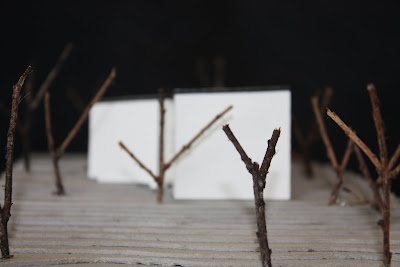
For this model, I wanted to experiment with other materials as i had mainly made all my models with balsawood. For this model, I used boxboard to complete the contoured landscape. I felt the use of boxboard was easier in some ways, harder in others. For example, whe n using boxboard, I didnt need to consider the direction of the grain as i needed to with balsawood. On the other hand, I felt it was sometimes more difficult to cut through.
I used little twigs for my trees and white card for the actual house. I chose to use white card, as it both emphasises the house, and also can appear as negative space, allowing more focus to be on the site (as this is more of a site model) .

Monday, September 6, 2010

MODEL-IT. in class project 2

attempt 1:


attempt 2:


attempt 3:


refined model 4:


progress models:
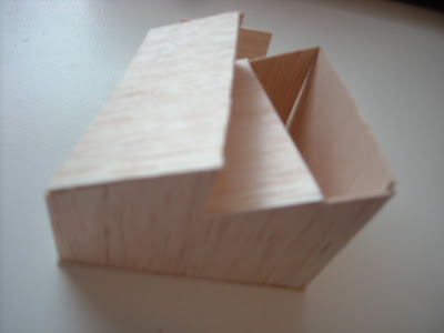
I really enjoyed this lesson. We were given a section to use, and three models to incorporate this section. after these three times, we were then told to make a more refined model. I wanted to be really different, and therefore, all my models were a bit crazy!